Overview of the Wheelhouse Local Seasonality Model

A detailed explanation of Wheelhouse's Local Seasonality model, one part of our industry's only transparent, published & auditable pricing engine.

Andreas B.
By Andreas Buschermöhle, Head of Product & Engineering

Updated: Oct 25, 2024

7 minute read

Product image

Overview

When predicting upcoming demand for a market, Wheelhouse has long aimed to isolate each market’s ‘Seasonality Curve’. This curve is one of the demand patterns we seek to understand, in order to help you better price your listings (other demand patterns include Day of Week, Local Events, etc)

In general, “Seasonality” refers to a broad, slow-moving demand curve that is both relatively predictable and repeats annually. For example, a summer “High Season” will often impact ALL listings in a market, every year, and in a relatively consistent manner. Predicting this demand curve accurately is a far different data science approach relative to detecting and responding to local events, which may impact fewer listings, infrequently, with less certain final booking outcomes.
For many years, Wheelhouse’s Seasonal Demand Curve for a listing has been calculated on a market level.

The benefit of this approach is that listings can “learn” from all the observed data/booking patterns in an entire market, to generate an informed seasonal demand curve. 

The drawback of this approach occurred for markets that clearly contained multiple, distinct seasonality curves.

For example, Wheelhouse serves markets that feature both a ski mountain and a popular lake front. In those markets, we’ve long observed highly differentiated booking patterns. To paraphrase our customers in these markets, “Our listings book from the mountain down in the winter, and the lake up in the summer.”

18 months in the making, we began research on various approaches that could create a listing-specific seasonality curve. 

Our goal was to create a seasonality curve that was much more listing-specific, while not removing too much of the signal we can derive from nearby listings.
For example, imagine a market with multiple ski areas. While these ski areas might be quite far apart, we were curious whether an approach would emerge that would allow these disparate - but similar booking areas - to share booking “learnings” in a beneficial manner.

To cut to the chase, we’re very happy with the results our new model is producing.

While recognizing the need to avoid hyperbole, the model appears to genuinely represent a 10x improvement in the precision of our Seasonality Demand curves - creating much more accurate listing-specific recommendations, while maintaining the ability to learn from a good sample size of similar, nearby properties.

As of today, customers can leverage this much more precise Seasonality model, immediately.

Methodology: Lake Tahoe Example

To explore our updated methodology, let’s examine the new approach as applied to the Lake Tahoe market. 

The “Lake Tahoe Market” (as defined by Wheelhouse) consists of several types of locations.  For example:

  • Ski Areas: Heavenly, Northstar, Diamond Peak, Squaw Valley, Alpine Meadows, etc.
  • Areas near the lake: South Lake Tahoe, Tahoe City, Kings Beach, etc.
  • Surrounding towns: Carson City, Minden, etc.

And, even though there is a large lake (and icy roads!) that separate different ski areas in the Tahoe market, the seasonal demand curves for places near ski resorts are often quite similar.  

For example, listings next to the Heavenly Ski Mountain have a very similar seasonality curve as listings next to Northstar Ski Mountain. 

Therefore, we can use these areas' similar travel patterns to improve the seasonal demand curve for a unit based on all data from similar locations.

Implementation

The baseline algorithm for identifying local seasonality is k-means clustering. In k-means clustering, we partition the data points into K clusters by minimizing the sum of squared distances between the data points and the cluster centers. 

In the simple example of the following graph, we generated some random data and used the algorithm to identify three clusters. It automatically picks out the three locations with the highest density of data points.

blog image

To identify locations that share a similar seasonality, we use this algorithm in a two-step approach.

Step 1: Identify Locations of High Unit Density

First, in a given market, we use k-means clustering to identify up to 50 clusters, as determined by listing density. These clusters are derived from the latitude and longitude coordinates of all listings, with each cluster illustrating an area with a high unit density. 

In the example of Lake Tahoe (shown below) we get the following map of clusters:

blog image

As expected, this approach clearly identifies high density clusters along the northern lake shore, the popular ski areas and in South Lake Tahoe and Truckee, and in the more “remote” areas of this market (e.g. Carson City, Minden), as well as and other clusters along Highway 50, along the south side of the market.

In short, this initial clustering has effectively categorized a once broad market into more geographic clusters.

Note:  Data-inclined readers might also recognize that this clustering approach also ‘illustrates’ where natural boundaries in a market occur. In short, our machine does not ‘know’ Lake Tahoe exists. However, by mapping listing clusters, an observer could quickly discern that there is an object (in this case, a lake) that is causing the clusters to appear in this manner.

Step 2: Identify Locations with Similar Seasonal Demand

Second, we again use our clustering algorithm to leverage booking patterns, to group the previously identified clusters by those that share a similar seasonal demand profile.

For this, we need to represent the seasonal demand in a way that can be used for clustering. To start, we generate a seasonality curve based on booking data from all the units in that cluster (for more on how we generate Seasonality curves, please refer to our pricing engine overview here)

Next, we extract features from this demand curve via fast Fourier transform (FFT) and use the FFT coefficients as features for clustering. 

The Fourier transform of a signal shows the different frequencies that make up the signal and their respective strengths (see below). By only keeping the strongest frequencies, we can capture the main characteristics of the seasonality curve.

In the case of a typical seasonality curve, we see that the largest coefficients (shown on the Y-axis, Amplitude) are at low frequencies, representing the slow changes in demand throughout the year.

In other words, the high amplitude wave (or, the largest coefficients) illustrate where “slow” demand changes occur - i.e. when a seasonal demand shift is building or receding.  This is in contrast to an event-driven demand, which would appear as a high amplitude and high frequency spike.

blog image

FFT Coefficients: Plotted

Next, it’s time to group these clusters, based on their identified curves.

At this point, it’s critical to “listen” to the right amount of data, in order to identify groups that perform similarly.

The graph below shows the result of different FFT approximations, in determining the demand curve for a cluster in Lake Tahoe. 

The original raw signal is a bit noisy, while the three FFT approximations using the three, five, and ten strongest frequency coefficients are much smoother. The more frequencies we include, the closer the approximation comes to fitting the original signal.

In other words, if we include FFTs from all clusters, our seasonality curve would essentially revert to our main market seasonality curve. Therefore, part of the success of our approach has just been in fine-tuning our the amount of FFT approximations we should use to discern accurate Seasonality Curves.

blog image

FFT Outputs:  Mapped

Using the first few FFT coefficients of each cluster's seasonal demand curve, we can apply k-means clustering again to group locations into clusters with similar seasonal demand. 

The following map of Lake Tahoe shows the result of identifying three seasonality clusters as represented by the color of the previously identified unit clusters. 

  • The red cluster contains the outer locations along Highway 50 and the towns on the Nevada side of the mountains. 
  • The black cluster contains the northern shore towns along the lake along with some areas in Truckee and South Lake Tahoe. 
  • The pink cluster contains some of the ski areas near Heavenly and Alpine Meadows.

While this example is a much simpler version of the level of detail our approach goes to, we hope it illustrates a methodology that produces (in our opinion) some fairly impressive results.

Again, you need to consider that our machine does not “know” any of the distinct geographic features of Lake Tahoe exist. It understands Lat/Long of listings, booking patterns, and some other variables. Therefore, the results seeming “logical” is the mark of a modeling methodology that works well, regardless of geography.

Step 3: Cluster Locations by Seasonality

blog image

Lake Tahoe Seasonality Clusters:  Plotted

As a final step, we take the complete data set from all units in a seasonality cluster to identify its seasonal demand curve, which results in the graph shown below.

  • The pink cluster mostly differs from the black cluster by having a slightly more muted demand, as this cluster generally contains listings that are further away from the lake. 
  • The red cluster has a demand curve that is mostly flat except for a slight increase in demand in the summer months and a slight decrease towards the end of fall. This cluster contains listings that are generally the furthest away from the lake and the ski areas, and therefore are (based on the data, and as one may expect) much less affected by seasonal changes in the general Lake Tahoe market.

As you can see, this approach already detects seasonality curves that are very unique, and quite similar. Therefore, with a deeper level of precision (okay, quite a bit deeper!), the quality of outcomes can be quite exceptional.

blog image

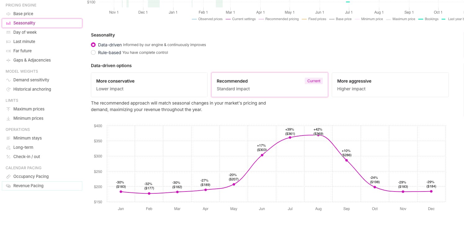
This seasonal demand curve is what we present on an individual listing level, in order for you leverage this more precise curve as a foundation for designing revenue strategies tied to seasonal demand (e.g. high/low season rate structures)
And, you can always easily automate this setting, which gives you the benefit of continuously accessing the most up-to-date seasonality signals, as we are constantly running our analysis to fine-tune this aspect of our pricing recommendations.

How This Looks for Your Market

For Lake Tahoe - and all markets - our approach identifies more than 3 seasonality curves. 

And, we have now run every market on Wheelhouse through this updated methodology (and are doing so in an ongoing fashion).  

As a result, the improved seasonality curve will be rolling out to all customers as of the end of October 2024.

To view this updated recommendation for your listing, you can visit your Seasonality Setting at any time, and review our data-driven recommendations.

blog image

Before rolling this out, we’ve reviewed the results across dozens of markets and customers, and the results so far have proven extremely promising.  

However, if you have questions about your specific recommendations, we’d love to hear from you!

Contributors

Andreas B.

Andreas Buschermöhle

Head of Product & Engineering

PhD Data Science & Engineering leader behind that most detailed and accurate pricing engine in the short-term rental industry.

author image

Andrew Kitchell

CEO & Founder

Andrew Kitchell is CEO and Founder at Wheelhouse, a revenue management platform that serves the leading professional operators in the vacation rental, short-term, corporate rental & boutique hotel space. 

Join the next generation of revenue managers

In minutes you can create your strategy and preview pricing across your calendar.